Loading...
A Selection of Successfully Completed Projects
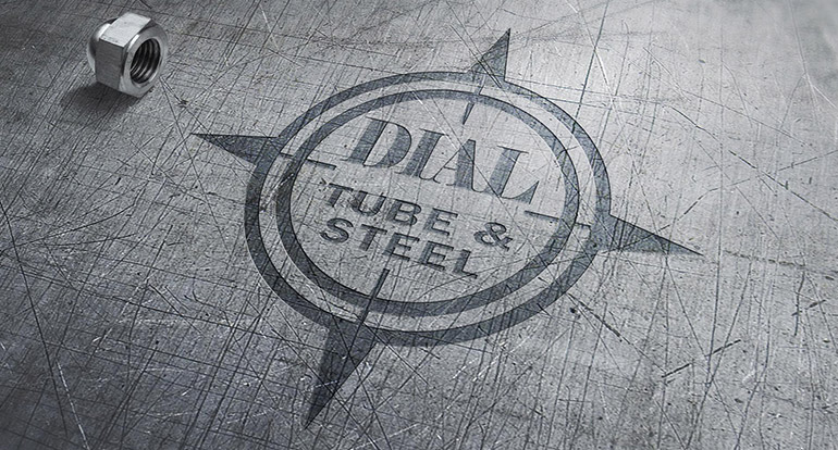
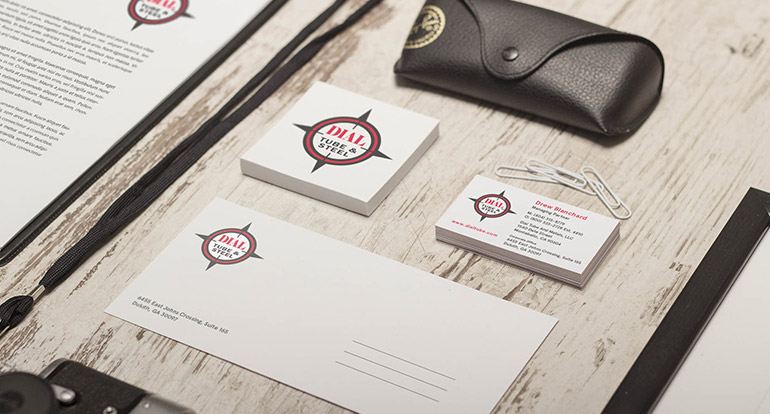
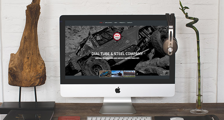
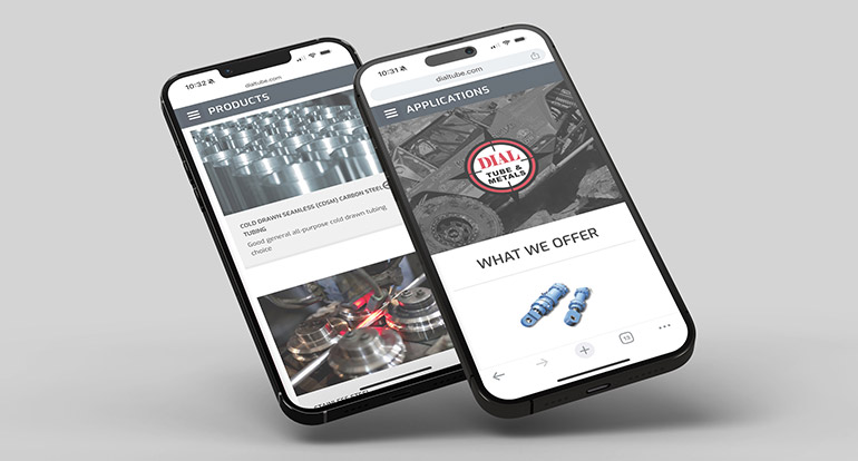
Dial Tube and Steel, a leading national materials supply company serving the manufacturing industry, sought a comprehensive brand refresh to enhance its visual identity and customer experience. With a diverse product range—from automotive frame parts and bicycles to helicopters—the company required a strong, cohesive brand presence.
We began with an updated logo design that honored their existing design while incorporating modern aesthetics. This new logo set the tone for the rest of the refresh. Following the logo update, we designed a suite of new stationery that aligns with the company's modernized brand image.
To complete the transformation, we developed a fresh new website that highlights Dial Tube and Steel's extensive offerings and positions them as a forward-thinking industry leader. The new website not only provides an intuitive user experience but also effectively communicates the company's commitment to quality and innovation. Through this comprehensive rebranding project, Dial Tube and Steel now boasts a revitalized visual identity that reflects its position as a top-tier supplier in the manufacturing industry.
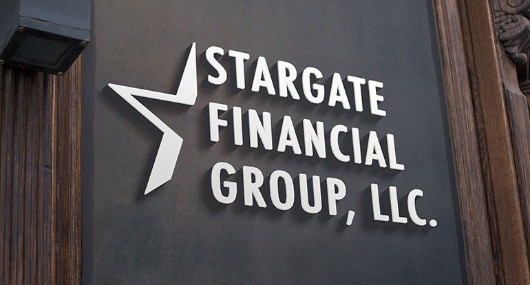
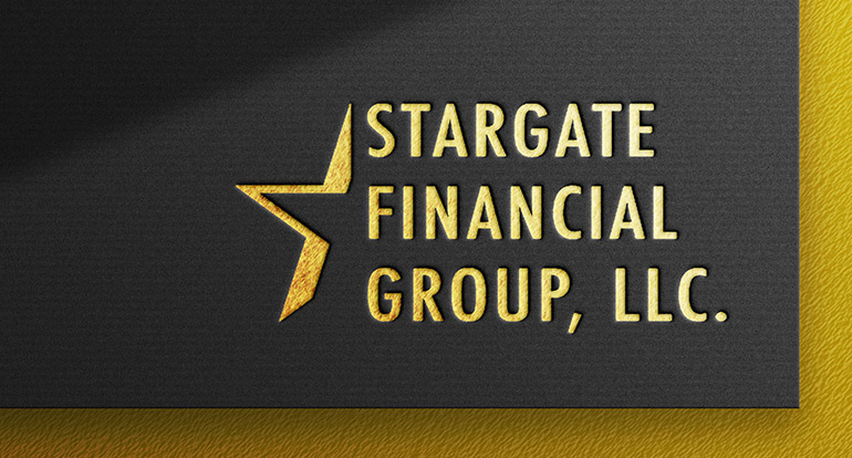
Stargate Financial Group, LLC entered the financial services sector as a startup with a vision to provide innovative solutions to its clients. We partnered with the company to create a fresh and impactful brand design that would set them apart in the industry.
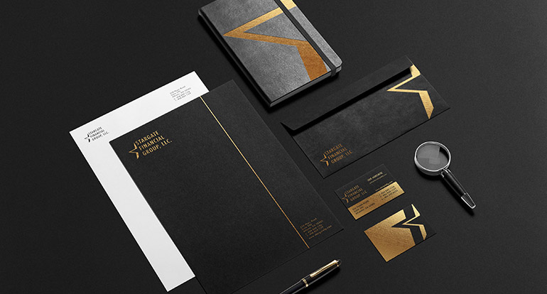
Our team developed a complete branding package that encompassed a sophisticated new logo and visual identity, applied across various print and digital mediums. This included a full stationery package for business communication and promotional materials.
To enhance the brand's presence, we incorporated stylish gold foil applications throughout the print media, adding a touch of luxury and boldness to the design. This strategic use of gold foil elevates the company's image, making it more memorable and appealing to clients.
Through our collaborative efforts, Stargate Financial Group, LLC now boasts a distinctive, eye-catching brand that resonates with its target audience and supports its mission of delivering top-notch financial services.

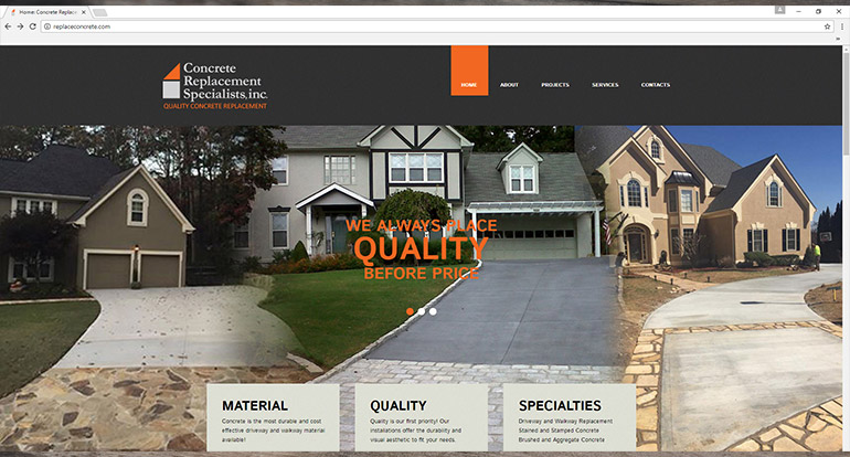
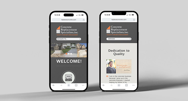
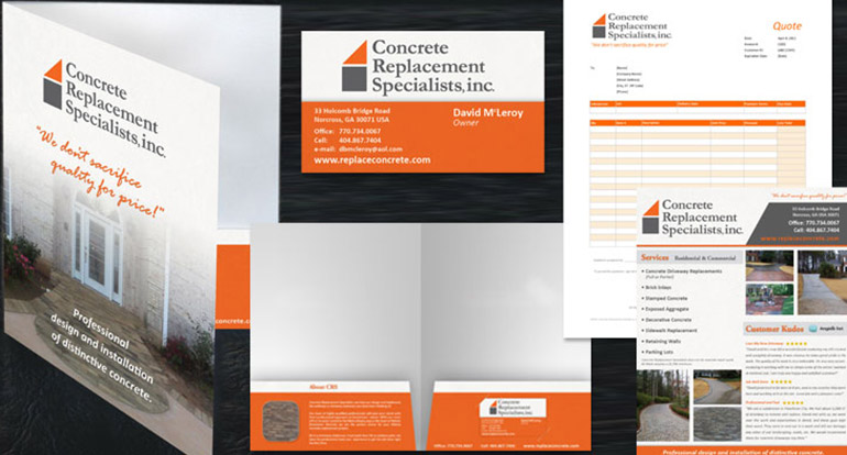
Concrete Replacement Specialists, Inc., a metro Atlanta-based provider of concrete construction services, sought a comprehensive rebrand and expansion of their print and digital collateral. Our team collaborated closely with the company to deliver a complete transformation of their visual identity and marketing materials.
We began by creating a modern, impactful logo design that set the foundation for the new brand. This updated visual identity was then applied across a variety of business communication collateral, including stationery, order forms, business cards, and more.
To enhance the company's online presence, we developed a comprehensive new website that showcases all of their products and services in an engaging and user-friendly manner. The website serves as a hub for potential and existing clients to learn more about the company's offerings.
In addition to digital assets, we designed a range of promotional materials to support the launch of the new brand and raise awareness among new and existing clients. These materials included print ads, brochures, and other marketing assets tailored to the company's target audience.
Through our strategic design solutions, Concrete Replacement Specialists, Inc. now boasts a cohesive and professional brand identity that supports its business growth and positions it as a leader in the local concrete construction industry.
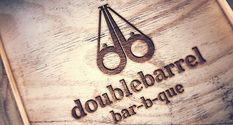
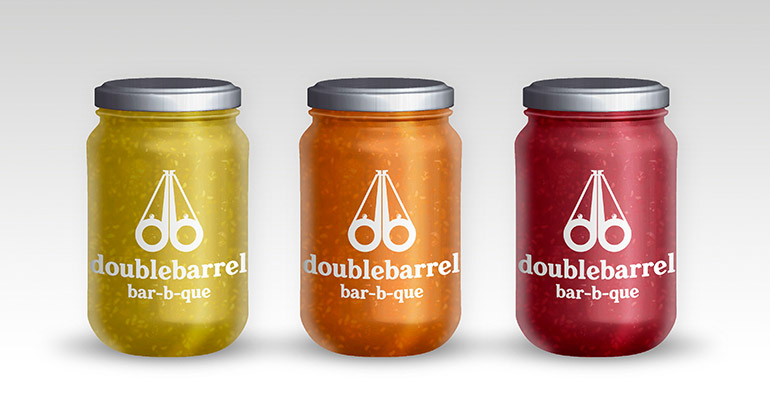
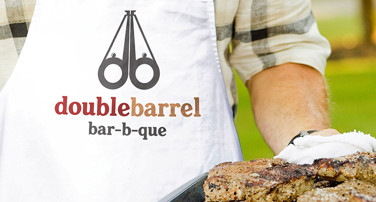
Double Barrel Bar-B-Que began as a beloved backyard tradition of smoking the finest meats in Dunwoody, Georgia. As their reputation for exceptional barbecue grew, the team expanded into local competitions and launched a new brand to offer restaurant and catering services.
Our team collaborated with the talented pit masters to create a bold and distinctive logo that embodies the essence of Double Barrel Bar-B-Que. We aimed to capture the rich flavors, rustic charm, and lively spirit of their craft while also showcasing the personalities of the team.
In addition to the logo, we designed apparel that allows the team to represent their brand with pride at competitions and events. The resulting designs are eye-catching, unique, and resonate with the company's dedication to delivering top-notch barbecue experiences.
Through our partnership, Double Barrel Bar-B-Que now has a cohesive visual identity that helps them stand out in the competitive barbecue scene and connect with their loyal customer base.
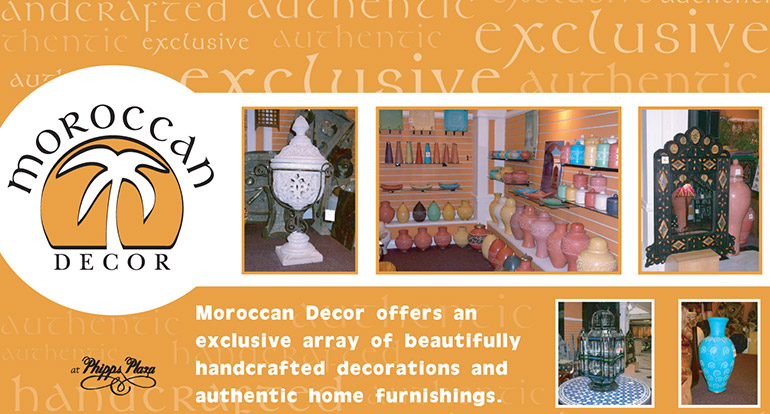
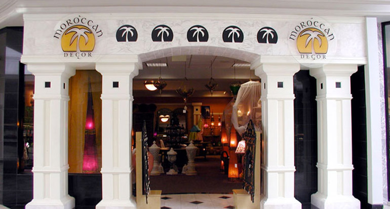
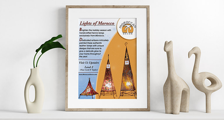
Moroccan Decor began as a boutique importer of handcrafted decorative items from skilled artisans in Morocco. As their business expanded, the need for a distinctive brand became evident. Our team partnered with the retailer as they established their new storefront in Phipps Plaza in Atlanta.
Starting from scratch, we collaborated with the client to design a brand that captures the essence of Moroccan artistry and culture. Our work encompassed a comprehensive range of design solutions, including store signage and graphics that reflect the brand's identity.
We also created print and digital marketing collateral to support the company's expansion, such as brochures, flyers, and social media graphics. Our team designed elegant hang tags and apparel that showcase the unique products available at Moroccan Decor.
Additionally, we developed stationery and an online shopping storefront website that offers a seamless experience for customers to explore and purchase the brand's offerings.
Through our partnership, Moroccan Decor now boasts a cohesive, vibrant brand that appeals to its target audience and enhances its presence both in-store and online. This successful branding initiative has elevated the retailer's profile and set the stage for continued growth and success.
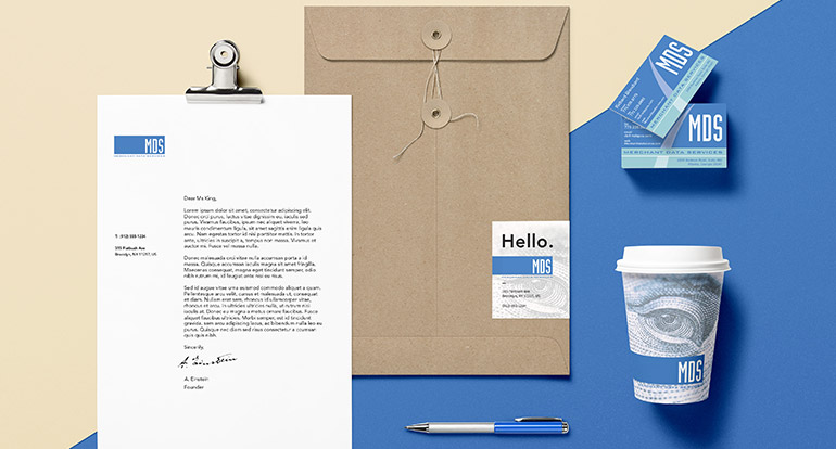

Merchant Data Services, Inc. (MDS) is an Atlanta-based provider of point of sale equipment and credit card services, serving the southeastern United States. As the company expanded its reach to new states and clients, they sought a brand refresh to elevate their services and enhance their market presence.
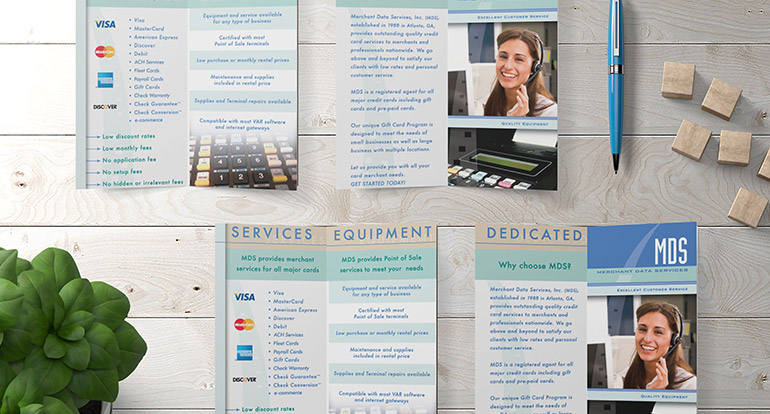
Our team began the project with a completely new logo design that modernized the company's visual identity while maintaining its core values. This new brand was then applied across a variety of business assets, including stationery, business communication collateral, brochures, mailers, and business cards.
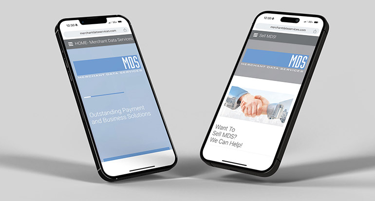
We also developed an informative, mobile-responsive website that showcases all of the services offered by MDS. The website is designed to provide potential and existing clients with easy access to detailed information about the company's offerings and solutions.
Through our strategic design approach, MDS now boasts a cohesive and professional brand identity that positions them as a leader in the industry. The refresh has enabled the company to effectively communicate its services to a broader audience and support its continued growth and expansion.
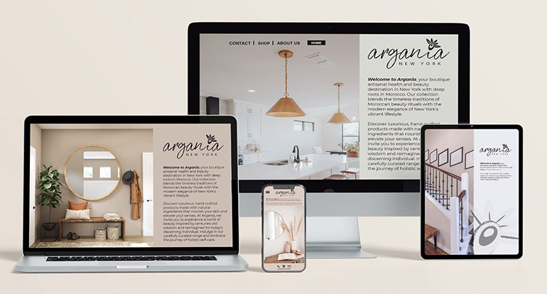
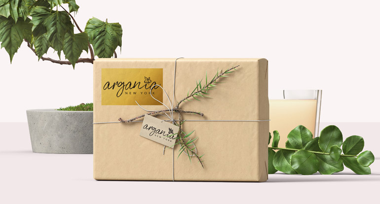
Argania is a boutique artisanal health and beauty brand based in New York, New York, with roots tracing back to Morocco. The client approached us to create a brand identity from scratch that would capture the essence of their heritage and the natural ingredients used in their products.
Our team worked closely with the client to develop a brand design that resonates with the brand's cultural origins and unique offerings. We crafted a bespoke logo featuring organic, flowing typography that echoes the shapes of the Argan tree fruit and leaves.
An illustrated representation of the fruit and leaves is seamlessly integrated into the typography, creating a harmonious and distinctive visual identity for the brand. This thoughtful design pays homage to Argania's Moroccan roots while presenting a modern and elegant aesthetic.
The resulting logo serves as the cornerstone of the brand, conveying Argania's commitment to quality, natural ingredients, and artisanal craftsmanship. Through our collaborative approach, Argania now boasts a memorable and impactful brand identity that sets them apart in the health and beauty market.
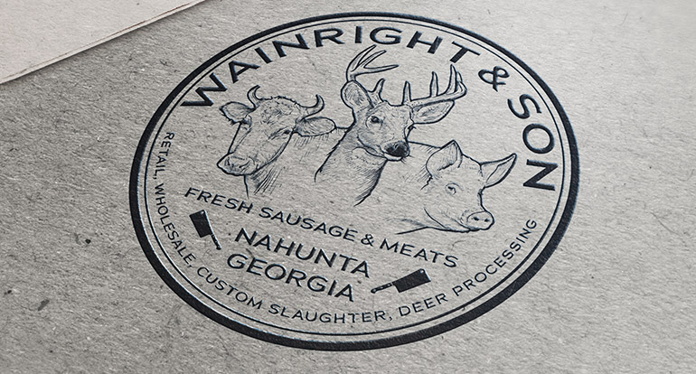
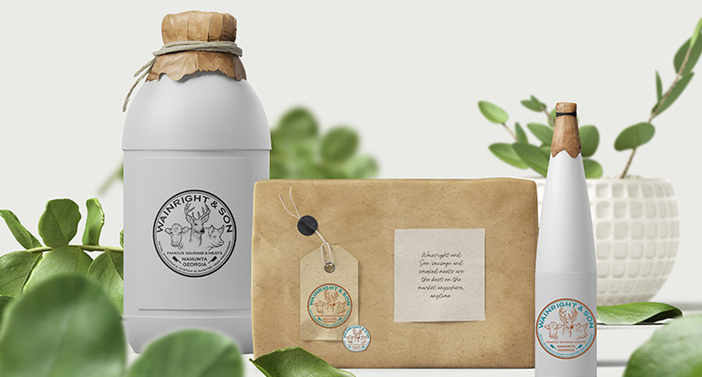
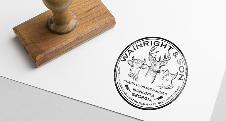
Wainright’s Sausage began as a small-town South Georgia farmer's hobby in the early 1930s, producing smoked sausage and curing hams and bacon for family and friends. As demand grew, the endeavor turned into a full-time business. When the company was sold, the new owner sought to distinguish the brand to support its expansion utilizing the new name Wainright and Son.
Dubberly Graphics partnered with the new leadership of Wainright and Son to develop a new brand design that encapsulates the rich heritage and high-quality offerings of the facility. Our approach combined clear and distinct typography with custom illustration to create a logo seal that reflects the company's history and values.
The new logo seal has been applied to signage and apparel, promoting the company and enhancing its visibility in the marketplace. This fresh visual identity supports the company's expansion efforts and reinforces its reputation for providing top-quality smoked meats and cured products.
Through our collaboration, Wainright and Son now has a cohesive and memorable brand that resonates with its loyal customer base and appeals to new audiences. Our design solutions have helped the company build on its storied legacy and continue its journey of success.
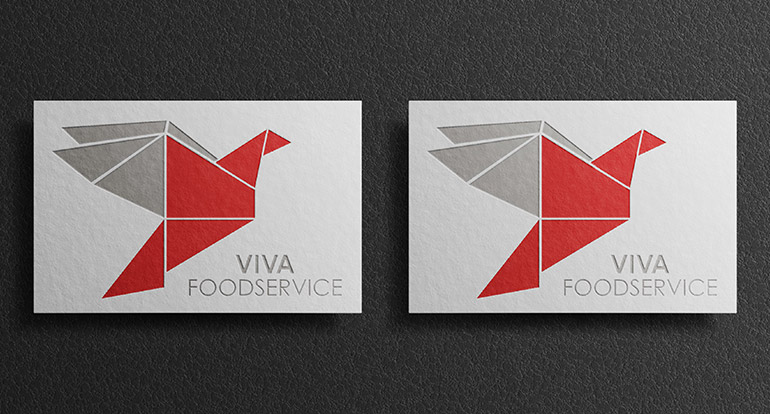
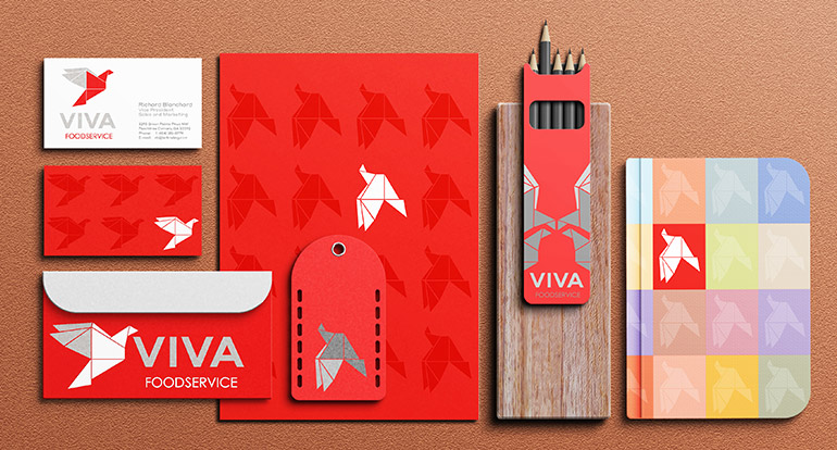

Viva Foodservice is a national supplier of restaurant ingredients, dedicated to sourcing and delivering the freshest, finest natural ingredients to customers across the country. Dubberly Graphics collaborated with the owner to develop a new brand that encapsulates the heritage of the products the company provides.
Our team worked closely with Viva Foodservice to understand their mission and vision, and then translated this into a brand that conveys the company's commitment to quality and sustainability. We designed a visual identity that reflects the natural, wholesome origins of their ingredients, highlighting the brand's authenticity and heritage.
In addition, we commissioned custom illustrations that complement the brand's narrative and values. These bespoke illustrations are used in both print and digital marketing collateral, enhancing the company's communications and strengthening its presence in the market.
The new brand identity provides Viva Foodservice with a cohesive and impactful look that resonates with its target audience. By capturing the essence of the company's commitment to delivering premium ingredients, our design solutions help establish Viva Foodservice as a trusted leader in the restaurant supply industry.
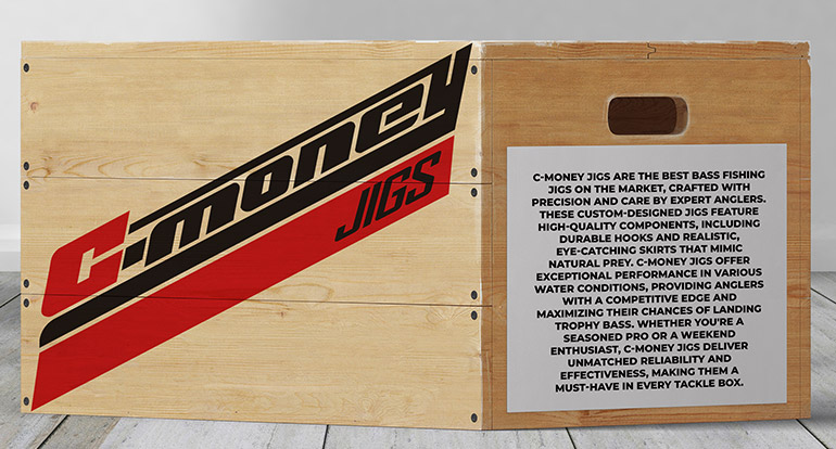
C-Money Jigs is a custom fishing lure manufacturer based in north Georgia. As a newcomer to the market, the company needed a bold, easy-to-read, eye-catching logo to enhance their packaging, advertising, and social media presence.
Dubberly Graphics collaborated with C-Money Jigs to create a striking new brand that stands out in the competitive fishing lure industry. Our design team developed a logo that captures the essence of the brand and resonates with its target audience.
The new brand design has been successfully launched and is making a strong market impact from day one. C-Money Jigs now boasts a memorable visual identity that supports its growth and establishes a strong presence in the market. Through our partnership, the company is poised to make waves in the fishing industry with its innovative and attractive custom lures.
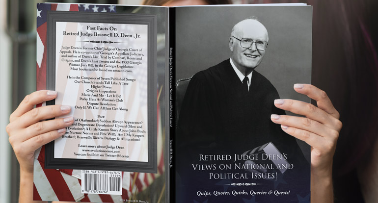
Retired Judge Braswell D. Deen, Jr. was a prolific author who wrote on a wide range of topics, including evolution versus creation theory, law, politics, and musical compositions published over decades. His latest and final book was designed by Dubberly Graphics and published by Outskirts Press.
Our team provided comprehensive design and production services to bring Judge Deen's words to life. We handled the book layout, editing, and cover design to create an engaging and visually appealing publication that honors the judge's legacy.
In addition to the print version, we consulted on the audiobook adaptation of the title, ensuring that Judge Deen's work could be enjoyed in multiple formats. Our goal was to provide a seamless experience for readers and listeners alike.
Through our collaboration with Judge Deen and Outskirts Press, we successfully delivered a polished and professional final work that showcases Judge Deen's unique perspective and intellectual contributions. We are proud to have been a part of bringing his words and ideas to a broader audience.
Golden Peach Boutique is a local clothing and home goods retailer in Georgia known for offering carefully curated collections that celebrate the charm of the South. Dubberly Graphics collaborated with the client to develop a fresh, custom-designed brand that reflects the boutique's locale and resonates with their customer base.
Our design team worked closely with Golden Peach Boutique to understand their vision and target audience. We created a new brand identity that captures the essence of the retailer's Southern roots and unique offerings.
The resulting brand design incorporates warm, inviting colors and elegant typography that align with the boutique's style and appeal to their clientele. This cohesive visual identity helps set Golden Peach Boutique apart from competitors and strengthens its market presence.
Through our partnership, Golden Peach Boutique now boasts a refreshed and memorable brand that enhances the shopping experience and fosters customer loyalty. Our design solutions support the boutique's ongoing success and growth in the local market.
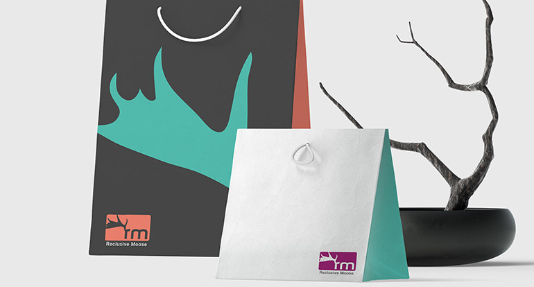
The Reclusive Moose is a Northwest Montana brand that provides unique, small-scale cabin resort lodging and excursions in and around Glacier National Park. Dubberly Graphics partnered with the owners to develop a new brand that stands out in the thriving hospitality market of northwest Montana.
Our team worked closely with The Reclusive Moose to capture the essence of the brand and its appeal to travelers from around the world. We focused on the richness and grandeur of the natural environment, aiming to create a brand that embodies the rustic charm and beauty of the region.
The resulting design features a rustic and simple aesthetic that is both eye-catching and easy to read. This distinct visual identity sets The Reclusive Moose apart from the multitude of other hospitality brands in the space and resonates with those seeking an authentic Montana experience.
Through our collaborative efforts, The Reclusive Moose now boasts a strong brand presence that enhances its appeal to visitors and helps establish the company as a leading choice for lodging and excursions in the area. Our design solutions support the brand's growth and success in the hospitality industry.
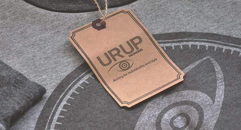
URUP Designs is an urban retailer based in Atlanta, Georgia, offering a curated selection of global fashion. The shop imports unique clothing and goods from Europe, emphasizing high-fashion design and distinctive style.
Dubberly Graphics collaborated with URUP Designs to create a new brand identity that captures the essence of the retailer's vision and sets them apart in the competitive fashion market. Our design team worked closely with the client to understand their target audience and goals, ensuring a cohesive and impactful brand.
The new brand was applied across a range of touchpoints, including in-store signage, merchandise tags, and marketing collateral. The design reflects the modern, sophisticated aesthetic of URUP Designs, appealing to the shop's fashionable clientele and enhancing the overall shopping experience.
Through our partnership, URUP Designs now boasts a strong and memorable visual identity that supports its position as a leader in the urban fashion scene. The cohesive branding helps drive customer engagement and supports the company's growth in the Atlanta market.
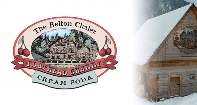
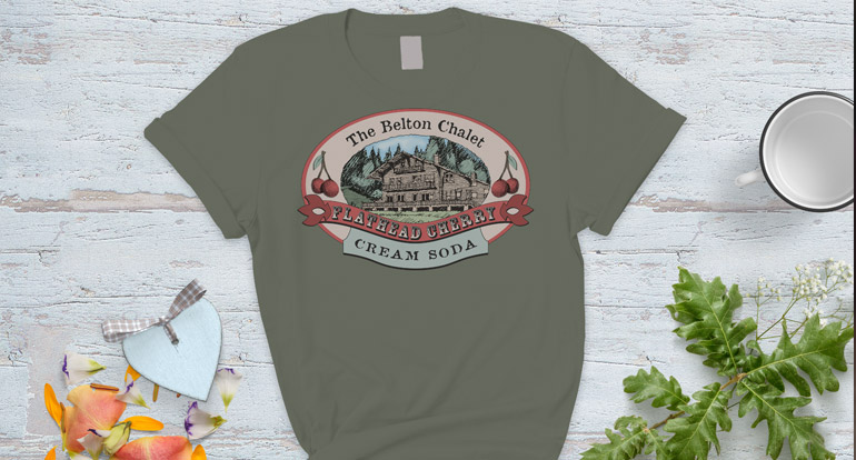
The Belton Chalet is the first of many historic lodges built near Glacier National Park. To create memorable, local offerings that appeal to the thousands of tourists visiting the Chalet each year, Dubberly Graphics partnered with the lodge's management to develop a new logo for a unique cream soda drink available exclusively at the lodge.
Our team worked closely with Belton Chalet to craft a logo that embodies the historic charm and natural beauty of the surrounding area. The design features elements inspired by the lodge's rich history and the scenic landscape of Glacier National Park.
The new logo enhances the cream soda's visual appeal and creates a cohesive branding experience for visitors. By infusing the logo with the lodge's identity and the local culture, we were able to develop a design that resonates with tourists and leaves a lasting impression.
Through our collaboration, The Belton Chalet now offers a unique and attractive product that not only delights guests but also strengthens the lodge's brand presence. This distinctive offering adds to the overall experience of visiting the historic lodge and contributes to its enduring legacy.
Commercial Forced Air (CFA) is a provider of cold-chain customized forced air solutions for the global perishable food market. As the business expanded, the client sought a brand refresh to align with its growth and evolving market needs.
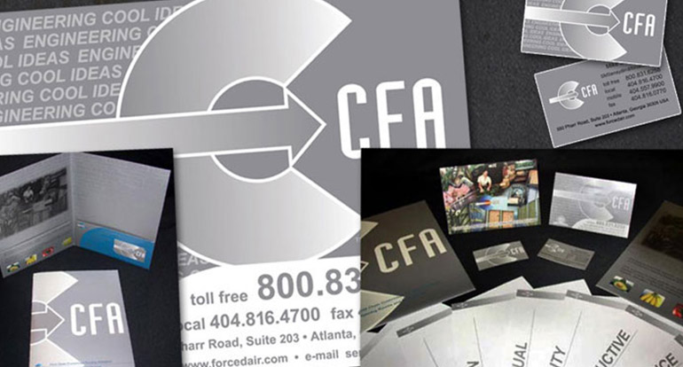
Dubberly Graphics partnered with CFA to modernize its brand across various elements. We began with the corporate logo, updating it to a contemporary and sophisticated design that reflects CFA's innovative approach to forced air solutions.
Our work extended to refreshing the company's color palette and illustrations, ensuring a cohesive visual identity across all brand touchpoints. We also redesigned proposal documents, marketing collateral, and business stationery, providing CFA with updated materials that effectively communicate its expertise and commitment to quality.
Through our design solutions, CFA now boasts a modernized brand that supports its expansion and enhances its reputation as a leader in the perishable food market. Our collaboration has helped position the company for continued success in the global marketplace.

Lawn Rander Landscape Group began as a one-man lawn-cutting business in metro Atlanta. After experiencing organic growth in its initial years, the owner recognized the need to create a cohesive and recognizable brand to continue the business's success.
The client desired a friendly, colorful design with a cartoon illustration to represent the brand's approachable and professional nature. Dubberly Graphics took the lead in commissioning the illustration and proceeded to design a logo that captures Lawn Rander's identity.
In addition to the logo, we designed print marketing collateral, proposal folders, vehicle wraps, and billboard designs that feature the new branding. These materials showcase the vibrant and playful aesthetic the client envisioned, helping the business stand out in a competitive market.
Through our comprehensive design approach, Lawn Rander Landscape Group now has a memorable and engaging brand that supports its growth and strengthens its market presence. Our collaborative efforts have helped the company connect with customers and establish a solid foundation for future expansion.
When Armadillo Roofing entered the Atlanta roof construction market, the owners sought Dubberly Graphics to create a comprehensive brand design that aligns with their vision and fits their needs.
The brand concept centers around a strong graphic to represent the durability and quality of the company's work, as well as a friendly icon to appeal to new customers. Dubberly Graphics crafted a logo that embodies these ideals, blending strength with approachability to reflect Armadillo Roofing's commitment to providing long-lasting, reliable roofing solutions.
In addition to the logo, we designed order forms and marketing collateral that feature the new branding, ensuring a cohesive and professional presentation across all touchpoints. These materials help Armadillo Roofing effectively communicate its services and values to potential clients.
Through our partnership, Armadillo Roofing now has a distinct and memorable brand identity that supports its growth and strengthens its reputation in the Atlanta roof construction market. Our design solutions have laid the groundwork for the company's ongoing success and customer satisfaction.
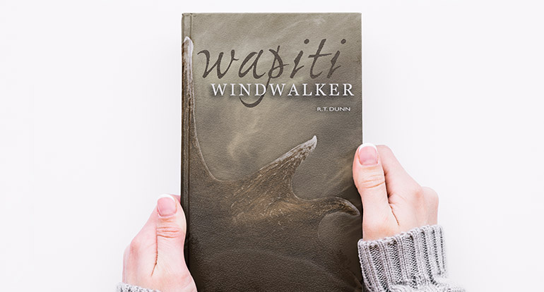
Dubberly Graphics collaborated with Montana-based author R. T. Dunn to design a book cover and poster for his latest release, Wapiti Windwalker. The project required a design that encapsulates the local scenery while evoking the mysterious atmosphere that aligns with the novel's storyline.
To achieve this, we incorporated visual elements inspired by the landscapes of Montana, blending natural beauty with an enigmatic touch. Our design captures the essence of Wapiti Windwalker and complements the novel's themes, providing an inviting visual entry point for readers.
In addition to designing the cover and poster, Dubberly Graphics provided on-site photography services to ensure the authenticity and high quality of the visuals used in the project. This approach allowed us to create designs that closely matched the author's vision and enhanced the overall aesthetic of the book and promotional materials.
Through our collaboration with R. T. Dunn, we successfully delivered striking designs that bring Wapiti Windwalker to life and attract readers to experience the captivating story within. Our work has contributed to the book's visual impact and market appeal.
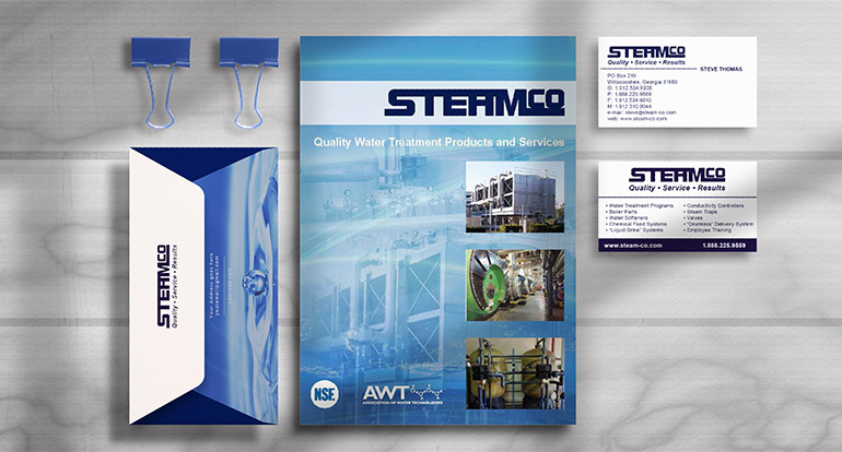
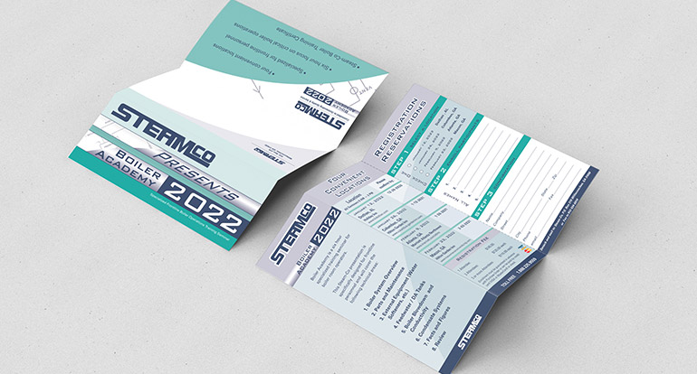
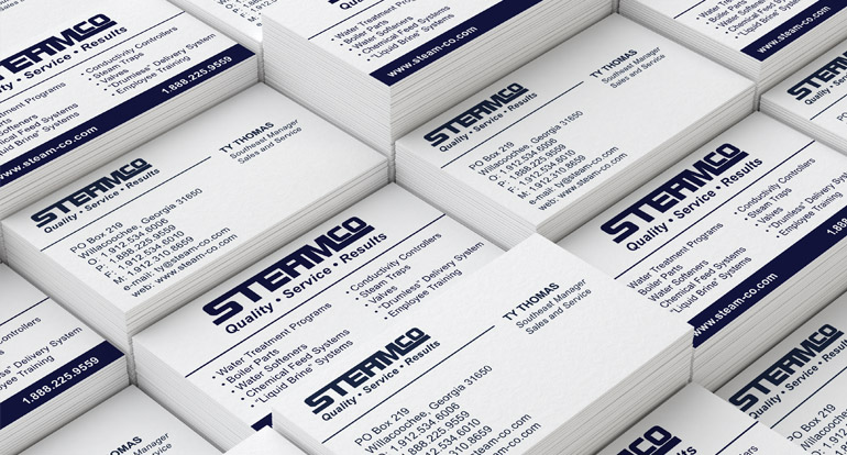
Steam-Co is a Georgia-based industrial chemicals and water treatment company serving the southeastern United States. When the company first opened its doors, they partnered with Dubberly Graphics to address a multitude of branding needs.
We began with a bold and easily recognizable logo design, which became the foundation for the company's brand identity. From there, we extended the brand across various touchpoints, including business stationery, marketing collateral, and vehicle graphics.
Dubberly Graphics also developed a custom responsive website for Steam-Co, providing a user-friendly platform for clients to learn about the company's products and services. In addition, we designed trade show booths to elevate the company's presence at industry events and facilitate connections with potential customers.
Steam-Co's strong brand identity remained prominent in the water treatment industry for decades, supporting the company's growth and reputation. The success of the branding initiatives played a role in the company's eventual acquisition by a larger corporation.
Our collaboration with Steam-Co exemplifies our ability to create cohesive and impactful brand experiences that leave a lasting impression and drive business success.
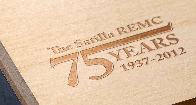
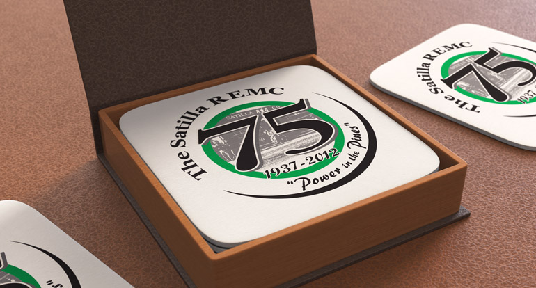
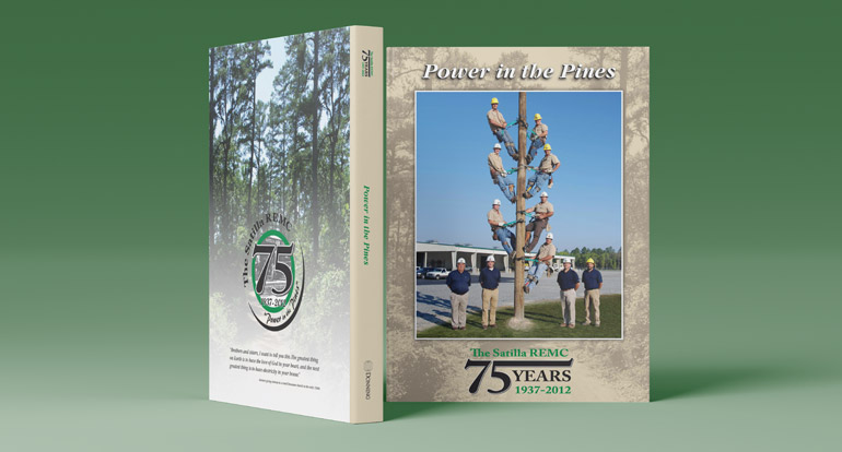
Satilla REMC's mission is to be recognized for its ability to meet the evolving needs and demands of its customers by providing superior energy and non-energy products and services. As the cooperative approached its 75th anniversary, Satilla REMC engaged Dubberly Graphics to commemorate the milestone.
Our team designed a pair of logos that reflect the history and achievements of the co-op while embracing a modern aesthetic. These special edition logos celebrate Satilla REMC's legacy and dedication to its community over the past 75 years.
In addition to the logos, we created a custom book cover design that tells the story of Satilla REMC's journey and milestones. The logos were then applied to apparel, print and digital marketing, and member gifts to mark the anniversary.
Through our collaboration, Satilla REMC now has a cohesive and memorable set of visuals that honor its rich history and reinforce its brand presence. These designs help celebrate the co-op's achievements and strengthen its connection with members and the wider community.
Tru-Lawn Landscaping is a lawn services company serving the Metro Atlanta area. The company sought to refresh its existing logo while paying homage to its original design and creating a more modern identity.
Dubberly Graphics worked with Tru-Lawn Landscaping to develop a new brand that captures the essence of the company's history and values while embracing a bold, vibrant color scheme. We also introduced new typographic solutions to breathe new life into the existing brand, making it more dynamic and engaging.
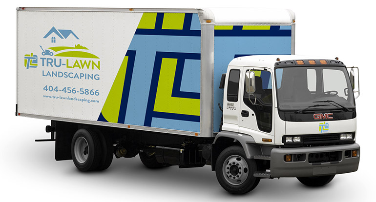
The updated graphics were applied to hats and clothing worn by staff on-site, creating a professional and cohesive appearance for the team. Additionally, we designed new maintenance truck graphic wraps to emphasize the brand and draw attention to the company's services as they travel throughout the Metro Atlanta area.
Through our collaborative efforts, Tru-Lawn Landscaping now boasts a refreshed and contemporary brand identity that enhances its visibility and strengthens its market presence. The new design solutions support the company's growth and reinforce its commitment to quality and excellence in lawn services.
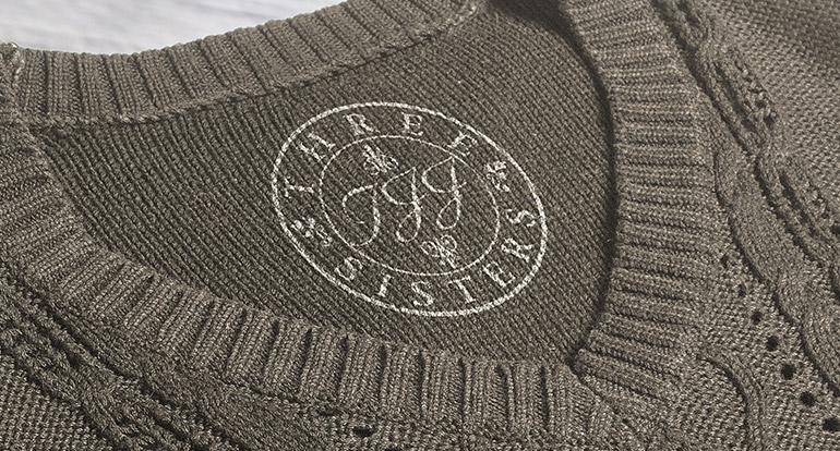
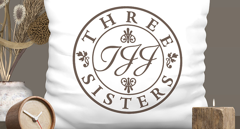
This custom home goods brand boasts a rich history influenced by nature, which guided our design process as we developed a new visual identity.
Our team focused on the existing values and intricacies of the brand, creating a simple yet distinctive logo that resonates with The Three Sisters' essence. By utilizing recognizable typography across various scales, we designed a logo that delivers memorable impact and strengthens brand recognition.
This new visual identity enables The Three Sisters to expand its reach and appeal to a broader audience of new clients and customers. The cohesive branding reinforces the company's commitment to quality and style, enhancing its position in the market as a trusted provider of elegant and timeless products.